Jeremy Grantham's latest letter published last week titled Entering The Superbubble's Final Act has sparked interest among investors and in the media - my thanks to a friend for alerting me to it. Herewith are my thoughts on the piece.
First, it is important to understand what Grantham means when he refers to a superbubble. In his letter, he notes that:
Ordinary bubbles are, to us, those that reach a 2 sigma deviation from trend. Superbubbles reach 2.5 sigma or greater.
Most of the time (85% or thereabouts) markets behave quite normally...It is only the other 15% of the time that matters, when investors get carried away and become irrational. Mostly (about 12% of the time), this irrationality is excessive optimism,...; and just now and then (about 3% of the time), investors panic and sell regardless of value...
This 15% is very different from ordinary bull and bear markets....My strong suggestion is to treat the superbubbles – 2.5 to 3 sigma events – as special, collectively unique occasions.
We’ve been in such a period, a true superbubble, for a little while now. And the first thing to remember here is that these superbubbles, as well as ordinary 2 sigma bubbles, have always – in developed equity markets – broken back to trend.
Frankly, I find the above quite confusing but believe that what Grantham is saying is that 85pct of the time, markets behave normally, and that these periods of normality encompass ordinary bull and bear markets, which he terms ordinary bubbles, or 2-2.5 sigma events. During the other 15pct of the time, markets are in a superbubble which he defines as 2.5-3 sigma events.
Here's my beef...
Sigma is a reference to standard deviation. 1 sigma = 1 standard deviation, etc. The distribution of deviations of market index values from trend approximate to a normal distribution, which means that 68.3pct of values are within 1 standard deviation, 95.4pct within 2 standard deviations, 99.7pct within 3, etc. 2.5 standard deviations means 98.8pct of values. Thus, the proportion of values between 2.5 and 3 standard deviations is 0.9pct - 99.7pct minus 98.8pct. This is very different to the 15pct that Grantham cites!
Second, the proportion of values between 2 and 2.5 standard deviations is 3.3pct. According to Grantham, this is where ordinary bull and bear markets reside. In which case what is happening during the other 81.7pct - 85pct minus 3.3pct - of the time, if not ordinary bull and bear markets? A look at a long-term chart of US equities will tell you that it cannot be sideways markets i.e., neither a bull nor a bear market. The reality - and indeed the theory - is that most of the time markets are either in a bull or a bear phase.
You may think I am being pernickety but in the world of financial analysis, numbers are very important.
Moving on...
Grantham's thesis is that US equities were in a superbubble in 2021 - presumably at the end of 2021 when they peaked. This superbubble then started to burst in the first half of 2022, following which US equities staged a bear market rally from mid-June to mid-August. Regardless of whether the bear market rally has already ended - according to Grantham they normally go on for longer but as he then notes there is no reason why this one couldn't be different - the next stage of the superbubble collapse will be driven by deteriorating fundamentals - falling corporate profits - with US equities ending up substantially below where they are today.
Despite the issues I had with Grantham's maths, I broadly agree with his thesis above. However, I have other issues that given the opportunity I would ask him about.
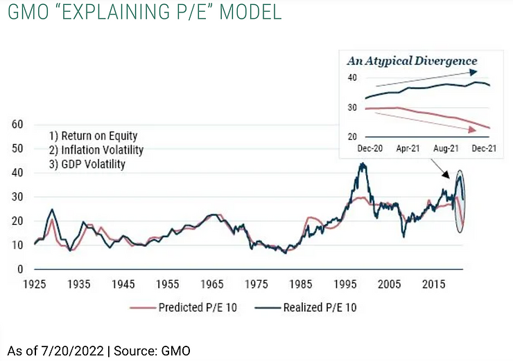
On page three of his letter, Grantham introduces his "Explaining P/E" model - see image below. The legend at the bottom describes the two lines as "Predicted P/E 10" and "Realized P/E 10". Nowhere in the text is there a mention of "P/E 10", though my guess is that the "10" is a reference to the denominator in P/E being an average of the last ten years of earnings. That said, it is not clear whether these earnings are real or nominal.
Also, the word "predicted" is misleading. If the red line was a prediction, it would extend to the right beyond the blue line. It doesn't. Grantham does state in the notes that "the model does not attempt to justify market prices in any way. It merely shows those financial inputs that have in the past statistically explained contemporaneous P/E multiples". But in that case why not use the term "model P/E" rather than "predicted P/E"?
Thirdly, the data in the box is not the same as that in the main chart that it purports to enlarge. In the box, the blue line just goes up. In the ellipse in the main chart, it goes up then down again.
Finally, there are three metrics listed in the top left of the chart: Return on Equity, Inflation Volatility, and GDP Volatility. There is no explanation in the main text as to what these are but I assume they are the variables on which realised P/E is regressed. The text mentions that:
the first leg down in today's superbubble was "explained" by rising inflation
And yet, rising inflation is not quite the same thing as "inflation volatility".
Grantham then lists a number of near-term and longer-term problems, most if not all of which I agree with. It is a list of the usual suspects such as food/energy/fertiliser, Chinese property market/covid, fiscal tightenings in advanced world, world demographics, climate change, etc.
My final gripe is the table in the Appendix which presents two major components of The Kalecki Equation - the change in the federal budget balance and the change in corporate profits, both as a percentage of GDP. Michał Kalecki, a Polish economist, surmised that the two coud be considered equal and opposites of each other on a ledger - a federal/public sector deficit would end up as a surplus in the corporate sector, whether directly or via consumer spending.
Anyway, Grantham's forecast for this year, 2022, for the 1-year change in the federal budget balance as a percentage of GDP is +11.5pct. Given that last year's balance was -11.0pct, this implies a surplus this year of 0.5pct - 11.5pct added to minus 11.0pct. And yet, according the The Congressional Budget Office's Long Term Budget Outlook published in July, the balance this year is forecast be -3.9pct of GDP. Furthermore, the balance for the first seven months was -2.1pct of GDP. Grantham's +0.5pct thus appears to be wildly at variance both with the official forecast and with the cumulative balance year to date. I would like to know where his +11.5pct number in the table comes from.
I am a big fan of Grantham's and indeed of his team's. They generally produce excellent analysis that considers investment markets from a long-term, valuation-oriented perspective, the correct one in my humble opinion.
My original intention had been for this post to be a synopsis of his seven page letter that I thought would be of interest to Chimp readers. However, as I waded through the letter I kept picking up on what I considered to be errors, and these became the greater focus of this post.
My concluding message is two-fold. First, Jeremy Grantham is, in my humble opinion, the Warren Buffett of asset allocation so his views are worth listening to - in this case that trouble lies ahead. Second, it is critical when writing financial market research that everything is clear, consistent, and correct. Too many mistakes can distract attention away from the conclusion.


Jeremy Grantham's latest letter published last week titled Entering The Superbubble's Final Act has sparked interest among investors and in the media - my thanks to a friend for alerting me to it. Herewith are my thoughts on the piece.
First, it is important to understand what Grantham means when he refers to a superbubble. In his letter, he notes that:
Ordinary bubbles are, to us, those that reach a 2 sigma deviation from trend. Superbubbles reach 2.5 sigma or greater.
Most of the time (85% or thereabouts) markets behave quite normally...It is only the other 15% of the time that matters, when investors get carried away and become irrational. Mostly (about 12% of the time), this irrationality is excessive optimism,...; and just now and then (about 3% of the time), investors panic and sell regardless of value...
This 15% is very different from ordinary bull and bear markets....My strong suggestion is to treat the superbubbles – 2.5 to 3 sigma events – as special, collectively unique occasions.
We’ve been in such a period, a true superbubble, for a little while now. And the first thing to remember here is that these superbubbles, as well as ordinary 2 sigma bubbles, have always – in developed equity markets – broken back to trend.
Frankly, I find the above quite confusing but believe that what Grantham is saying is that 85pct of the time, markets behave normally, and that these periods of normality encompass ordinary bull and bear markets, which he terms ordinary bubbles, or 2-2.5 sigma events. During the other 15pct of the time, markets are in a superbubble which he defines as 2.5-3 sigma events.
Here's my beef...
Sigma is a reference to standard deviation. 1 sigma = 1 standard deviation, etc. The distribution of deviations of market index values from trend approximate to a normal distribution, which means that 68.3pct of values are within 1 standard deviation, 95.4pct within 2 standard deviations, 99.7pct within 3, etc. 2.5 standard deviations means 98.8pct of values. Thus, the proportion of values between 2.5 and 3 standard deviations is 0.9pct - 99.7pct minus 98.8pct. This is very different to the 15pct that Grantham cites!
Second, the proportion of values between 2 and 2.5 standard deviations is 3.3pct. According to Grantham, this is where ordinary bull and bear markets reside. In which case what is happening during the other 81.7pct - 85pct minus 3.3pct - of the time, if not ordinary bull and bear markets? A look at a long-term chart of US equities will tell you that it cannot be sideways markets i.e., neither a bull nor a bear market. The reality - and indeed the theory - is that most of the time markets are either in a bull or a bear phase.
You may think I am being pernickety but in the world of financial analysis, numbers are very important.
Moving on...
Grantham's thesis is that US equities were in a superbubble in 2021 - presumably at the end of 2021 when they peaked. This superbubble then started to burst in the first half of 2022, following which US equities staged a bear market rally from mid-June to mid-August. Regardless of whether the bear market rally has already ended - according to Grantham they normally go on for longer but as he then notes there is no reason why this one couldn't be different - the next stage of the superbubble collapse will be driven by deteriorating fundamentals - falling corporate profits - with US equities ending up substantially below where they are today.
Despite the issues I had with Grantham's maths, I broadly agree with his thesis above. However, I have other issues that given the opportunity I would ask him about.
On page three of his letter, Grantham introduces his "Explaining P/E" model - see image below. The legend at the bottom describes the two lines as "Predicted P/E 10" and "Realized P/E 10". Nowhere in the text is there a mention of "P/E 10", though my guess is that the "10" is a reference to the denominator in P/E being an average of the last ten years of earnings. That said, it is not clear whether these earnings are real or nominal.
Also, the word "predicted" is misleading. If the red line was a prediction, it would extend to the right beyond the blue line. It doesn't. Grantham does state in the notes that "the model does not attempt to justify market prices in any way. It merely shows those financial inputs that have in the past statistically explained contemporaneous P/E multiples". But in that case why not use the term "model P/E" rather than "predicted P/E"?
Thirdly, the data in the box is not the same as that in the main chart that it purports to enlarge. In the box, the blue line just goes up. In the ellipse in the main chart, it goes up then down again.
Finally, there are three metrics listed in the top left of the chart: Return on Equity, Inflation Volatility, and GDP Volatility. There is no explanation in the main text as to what these are but I assume they are the variables on which realised P/E is regressed. The text mentions that:
the first leg down in today's superbubble was "explained" by rising inflation
And yet, rising inflation is not quite the same thing as "inflation volatility".
Grantham then lists a number of near-term and longer-term problems, most if not all of which I agree with. It is a list of the usual suspects such as food/energy/fertiliser, Chinese property market/covid, fiscal tightenings in advanced world, world demographics, climate change, etc.
My final gripe is the table in the Appendix which presents two major components of The Kalecki Equation - the change in the federal budget balance and the change in corporate profits, both as a percentage of GDP. Michał Kalecki, a Polish economist, surmised that the two coud be considered equal and opposites of each other on a ledger - a federal/public sector deficit would end up as a surplus in the corporate sector, whether directly or via consumer spending.
Anyway, Grantham's forecast for this year, 2022, for the 1-year change in the federal budget balance as a percentage of GDP is +11.5pct. Given that last year's balance was -11.0pct, this implies a surplus this year of 0.5pct - 11.5pct added to minus 11.0pct. And yet, according the The Congressional Budget Office's Long Term Budget Outlook published in July, the balance this year is forecast be -3.9pct of GDP. Furthermore, the balance for the first seven months was -2.1pct of GDP. Grantham's +0.5pct thus appears to be wildly at variance both with the official forecast and with the cumulative balance year to date. I would like to know where his +11.5pct number in the table comes from.
I am a big fan of Grantham's and indeed of his team's. They generally produce excellent analysis that considers investment markets from a long-term, valuation-oriented perspective, the correct one in my humble opinion.
My original intention had been for this post to be a synopsis of his seven page letter that I thought would be of interest to Chimp readers. However, as I waded through the letter I kept picking up on what I considered to be errors, and these became the greater focus of this post.
My concluding message is two-fold. First, Jeremy Grantham is, in my humble opinion, the Warren Buffett of asset allocation so his views are worth listening to - in this case that trouble lies ahead. Second, it is critical when writing financial market research that everything is clear, consistent, and correct. Too many mistakes can distract attention away from the conclusion.
Originally Posted on chimpinvestor.com